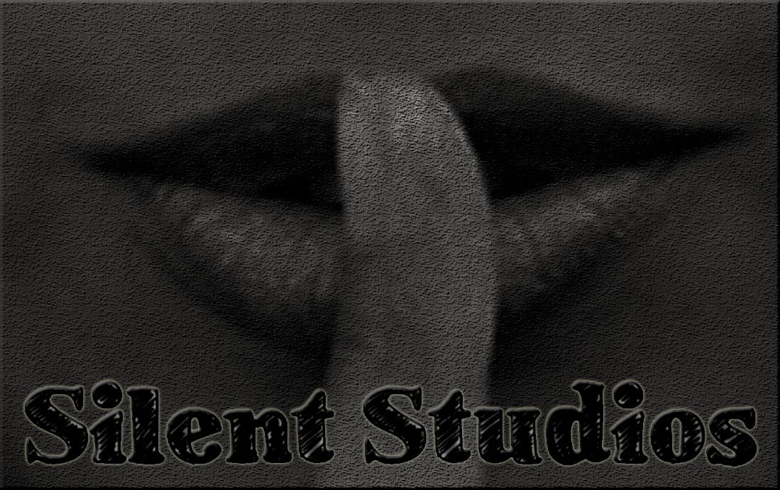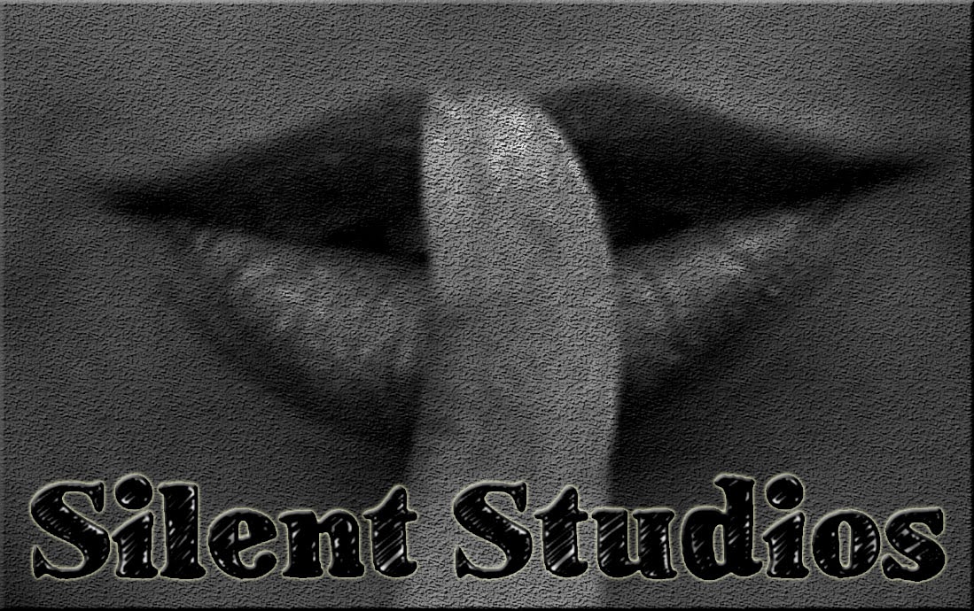

In Wednesday's lesson, the task for my group and I was to create a production company name, and a logo. As our film genre is a thriller, we decided the name of our company should be 'Silent Studios'. We decided this due to its dark meaning, and the fact that the word 'silent' almost resembles the storyline of most thriller's as they don't normally give away the twist until the end of the film.
We came up with these two logos for our production company, despite being extremely similar. the darker tint on the second image gives a haunting effect. We liked this logo as the picture of the finger over the lips represents silence, and symbolises the word 'silent' in our company name, 'Silent Studios'. also, it represents secrecy and privacy which is an occurring theme in our film. The text is also very important as it is styled and looks as if it has been eroded and broken, which gives good relatable theme within our films idea and style.