Tuesday 28 January 2014

Lesson journal 22/01/14 - Codes and Conventions (thriller)

In today's lesson, we were asked to research Codes & Conventions of our chosen film genre, which in our case, is a thriller. This is a powerpoint my group made on what should be included in a thriller...

Monday 27 January 2014

Bubbl.us brainstorms...


This was our first brain storm for our film genre and idea. We used Bubbl.us which allowed us to use fun color and text. This made it enjoyable t look at and read and is more attractive and neater than using a pen on a piece of paper.


After confirming ideas, and getting a clear aim of what we wanted, we remade our Bubbl.us plan. Having our first plan made it easier to alter our original ideas to change them to our final and more accurate ideas.

Saturday 25 January 2014

Roland Barthes' enigma code...

Roland Barthes' was born in 1915 in Cherbough, Manche. Bartges' was a French literary theorist, critic and philosopher. He studied the history of cultural signs and symbols. His theory suggests that a piece of film, television or image (poster) can create a mysterious feel to the audience causing them to be drawn in and intrigued and also allowing them to have an interest in the theme of the piece. For example, a murder story will not give away who the murderer is until nearer the end of the film. This makes the audience question themselves and to think, 'Who is the murderer?' According to his enigma code, there are more ways to read text, to uncover a text's plural meaning you have to read the text, then re-read it and everytime time you read it you reveal another meaning within the text.

"A galaxy of signifers, not a structure of signifieds; it has no beginning; it is reversible; we gain access to it by several entrances, none of which can be authoritatively declared to be the main one; the code it mobilises extend as far as the eye can read, they are indeterminable. The systems of meaning can take over this absolutely plural text, but their number is never closed, based as it is on the infinity of language" - Roland Barthes


Barthes' had a theory of five codes, which are...

The Hermeneutic code - the voice of truth
The Proairetic code - the voice of empirics
The Semantic code - the voice of the person
The Symbolic code - the voice of the symbol
The Cultural code - the voice of knowledge

The Hermeneutic code is where the story avoids telling the truth or revealing all the facts which allows the text to drop clues throughout and keep the text a mystery to the readers. This makes the audience eager to find out what happens in the story and keeps the firmly drawn in. This leads on to the next code.
The Proairetic code is the way the tension is built up and the way the audience is left to ask questions and think of conclusions to the story.
The Semantic code singles out any element in a piece of text that suggests or gives away any clear evidence of the actual meaning of the text.
The Symbolic code is a similar code to the Semantic code, but instead, organises the Semantic meanings into more detailed categories. This leads to new meanings coming from opposing and conflicting ideas.
The Cultural code is when the audience looks deeper into the knowledge of ideology and morality.


When reading and studying text, using these codes make it much easier to break down and understand more easily. Berthes' theory can also be used when looking at and trying to understand title sequences.  This is due to the reoccurring theme of title sequences dropping sly hints about the films main storyline.

Wednesday 22 January 2014

Kyle Cooper


As we analysed the title sequence of 'Se7en', we decided to do some research on Kyle Cooper, the man who created the title sequence, for influence and ideas to input into our very own sequence. Born in 1962, Cooper always had a love for art and graphics. As he grew older, his interest led to him attending the University of Yale, where he studied and achieved his degree in Graphic Design. Kyle's most popular and renowned piece of woke to date was his title sequence he produced for the film 'Se7en' in 1995. Since then, he has had the opportunity to produce the title sequences for the following films...


  • The Mummy (1999)
  • Spiderman (2002)
  • Dawn of the Dead (2004)
  • Superman Returns (2006)
  • Ironman (2008)
  • Sherlock Holmes (2009)
Not only was it film companies that took a taste for Cooper, but the producers of TV shows as he done work for the following TV shows...

  • American Horror Story
  • The Walking Dead
Overall, after looking at both Saul Bass and Kyle Cooper, our group believe that Cooper's work had more of an influence on us than Bass's. This is due to the style of Cooper's and that the fresh 
feel of his work works better with our thriller genre.

Thursday 16 January 2014

Napoleon Dynamite title sequence analysis - Task 2 G321

Napoleon Dynamite analysis...

From this title sequence, you can tell that this film is going to be based on/in a stereotypical American high school . We get this vibe from the sequence as numerous stereotypical American youth related items appear in it. In this short two and a half minute clip, we see different elements of it's youth with items such as a high school student card, and various types of typical American food, such as a corn dog, nachos and a peanut butter sandwich resting on top of a brown paper lunch bag, highly linked with American high school culture featuring in this opening. 

From accurately guessing the setting of the film from just watching the sequence, we can also get a rough idea of what sort of person the main character is going to be like. Yet again, the items that are  featured in this sequence are items that stereotypically affiliate with a 'nerd' or 'geek'. We see a 'U.F.O Abduction Insurance' card very early on in the sequence. This instantly gives us a brief idea that this film may contain a 'nerdy' character due to the fact he/she is interested in space and aliens. 

The next big hint we get is about half way through the sequence when we see a home-made looking ninja star. This tells the audience that the main character is into their action movies and possibly uses this hand-made 'weapon' to reenact scenes from action films and wrestling programmes he/she watches.

Shortly after seeing the 'weapon', two library books appear in the sequence. Yet again, this is another clue to helping us find out the type of character featuring in this film. not just the fact that there are library books, but the fact that the two books they have rented out are called 'Bigfoot and Me' and 'Sciences and Centaurs'. This is another addition to their beliefs and interests in space and mythological creatures.

Nearer the end of the sequence, two drawings appear one after the other containing pictures of ancient looking fighters and warriors fighting dragons and large looking birds. This is another sign of the passion he has for war and mythology.

Towards the end of the sequence, a few stationary items appear on scene with the names of the writers carved into pencils and written on rubbers. This is a clever way of showing the audience who wrote the play, still in a way that relates to the character, a nerd who uses a lot of stationary to do his work and drawings.

The sequence finishes with a plate of the most stereotypical American food resting on a table from a birds eye view. A burger and fries. On the burger lay the name of the director written out in a sauce before being aggressively squashed by the top half of the bun, like an immature child.

This sequence is very clever in giving a huge amount of information without showing us any of the characters appearances or the setting of any of the scenes. It sets up the film and gives a brief set of information to the audience without ruining any surprises the film may have in store. In this clip, we see the names of everyone heavily involved in the film, plus the genre and style of the film and its characters all at the same time. Despite the simpleness of this opening sequence, it gives more than enough information and details to set up the rest of the movie. 

Tuesday 14 January 2014

Task 1 - History and Art of title sequences.


mocking-bird-and-untitled.jpg

"If there were a hall of fame for film title design, Stephen Frankfurt’s sequence for the 1962 film “To Kill A Mocking Bird” (below, upper row) would have a seat of honor. Cameron Crowe referenced it in “Almost Famous” (lower row):" -


I found this picture and this piece of information very interesting, due to the fact that Stephen Frankfurt's sequence has been re-interpreted by Cameron Crowe in his film "Almost Famous". However, the interesting thing about this, is the fact that there are 38 years difference between the making of these two films. From the pictures used in the sequence, there is a noticeable difference in the props used and how they have modernized. Also, the main difference is colour. In the pictures from the 1962 sequence, they are in a black and white contrast, whereas the more recent sequence, the pictures are in colour and more clear.


“Humorous Phases of Funny Faces” (1906) — was directed by J. Stuart Blackton, who many consider to be the father of American animation. Not only is it one of the first animated films, it is among the first to feature an animated opening title, making it a precursor of the modern title sequence" 


After watching this clip, you can tell that its possible that this sequence plays a huge part in the way title sequences are made today. Although this title sequence is very simplistic, for something made so early with such little technology and skills allowing them to do something different, this sequence works so very well. It is catchy and different engaging the audience making them want to carry on watching it.


The concept of score visualization first conceived by Oskar Fischinger in his film “Studies” anticipates the effects created by Saul Bass in “The Man With the Golden Arm” (1955) and later by Susan Bradley in “Monsters, Inc” (2001): 

After reading this information and watching both clips, many factors stand out that are similar between these two clips. Although there is 56 years difference between the two sequences, there are many of the same elements between these two clips. Straight away, the music instantly sounds the same. The classic sound of American Jazz features in both of the clips. Also, the structure of the sequence is very similar as both contain shapes and objects moving around the screen to create an animated effect.


intertitles-example.jpg


The following inter-titles are typical of silent movies. A shot from the comedy The New Janitor (1914) featuring Charlie Chaplin is on the right, and the silent western West of Hot Dog (1924) is on the left:


I was really interested when reading about silent movies and their 'inter-titles' and how the comedic effect of a comedy could entertain the audience by being an 'inter-title'. Charlie Chaplin is known for being one of the greatest mime/comedic artists ever, and seeing how is work was put across to his audience is really interesting but strange as attempting to imagine such a huge comedic effect being able to come across by just words on a screen was fascinating. However, this only credits Chaplin even more in being able to have that effect on the audience.


thts-all-folks.jpg


font_details.html.jpg


Waltograph was created by Justin Callaghan in an attempt to capture the spirit of the familiar Walt Disney signage.


Here’s a cheerful Looney Tunes-inspired font family called That’s All Folks.

The typography for films are very interesting and its strange how a film that uses a certain font can then make that font so noticeable. For example, the 'Looney Tunes' font will always be recognised for being the font for the Warner Bros. company. Also, the classic Disney font will always be renowned for being the font for the classic film and programme company Walt Disney that have made, arguably, some of the best and most popular family films in history. First sight of these fonts, instantly we know where we have originally seen them.

First draft film ideas...

Journal entry - 08/01/14

Journal entry for our lesson on Wednesday 8th January.

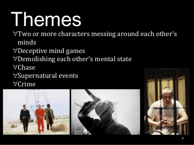
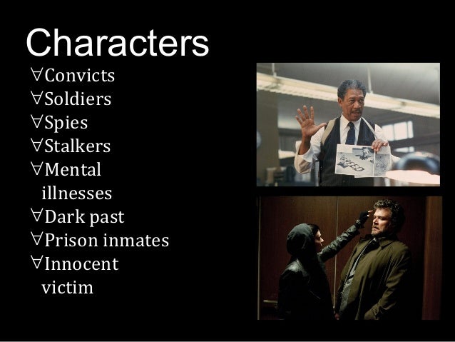
In today's lesson, we were told about how our coursework project was going to pan out. We were divided into two groups of four, then given our project task. The group I was put into consisted of Sophie Scott, Lucy Abbott, Megan Harris, and myself. Once in our groups, we were told that our project was to create an opening title sequence for a film idea we had to come up with. Once being told the task, my group and I sat around a table discussing genres we would be interested in basing our film on. By doing so, we gradually whittled all our ideas down to about two or three we could possibly use. The ideas we had were, horror, thriller and tragedy. We wanted our film to touch the audience emotionally, which we also discussed on being aimed towards the young teens to middle-aged members of the public.

After finalizing our points and getting a brief idea of what our opening title sequence would entail, we were then told to create a pitch for our film idea, which we had to then present to the other group(s) in our Media lesson with Sinead on Monday 13th January in a powerpoint format. With the remaining time we had, by the end of the lesson, we wanted to at least have a brief storyline for our film, that we could take note of and look at in later lessons, and for it to also be something to look at and relate to and reflect on. My group and I also used social networking sites such as Facebook to share ideas and still work on the subject in out-of-school hours. By doing this, we managed to be more organized and understanding and even assigned each member of the group to certain roles in research. Being the only male in our group, I approached the role of researching male actors we could use to play the male character in our film. i used the researched information in our powerpoint we are going to present next lesson.
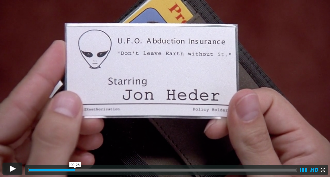